
Biller Portal Dashboard Redesign
In Q2 2025, I was tapped by the Analytics team to provide insight and designs for the biller portal homepage. A high-visibility project amongst teams, I jumped at the opportunity to work cross-functionally and do some meaningful research to help inform business strategy and design direction.
Redesigning a homepage from avoidant to engagement
Redesigning a homepage from avoidant to engagement
20x ROI, +86% funnel volume, +47% conversion, -58% bounce, +14% engagement, 99% significance
Lead Product Designer
Senior Design Analyst
Collaborators
Client
InvoiceCloud
Challenges
As the project was spearheaded by the Analytics team, I was positioned to ensure that Product was managing outcomes and expectations. I had to learn the fine balance of working collaboratively and allowing their team to take ownership, yet ensure that Product was in charge of all feature and product releases.
Despite high visibility, the project was not on the roadmap, so I needed to be careful about juggling priorities with other roadmap items.
Many teams were enthusiastic about this project and wanted a seat at the table for this project. It was important that Product was managing expectations and the outcomes.
Opportunities
Constantly at the mercy of hitting quarterly commitments, putting out fires, and quick iterations, I saw this opportunity to allow the research do the talking. Data could inform the design strategy, layout the requirements and inform the design direction for once.
Process
The State of the homepage

Brainstorming Sessions with CSMs
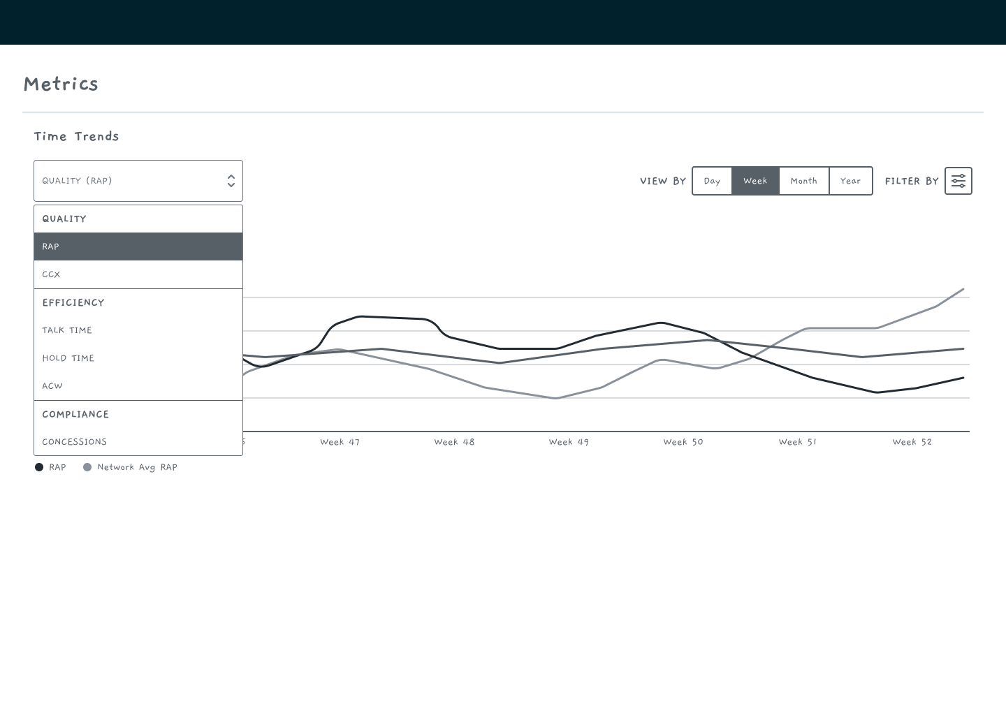
The current homepage is a “dashboard” with limited views, no flexibility, and no meaningful visual information of data. Additionally, the dashboard doesn’t have metric definitions and details, which could be used by billers to better understand the data that they are seeing.
Irrelevant Charts
Inaccurate data
Static Time Ranges
Poorly formatted graphs
The CSM teams broke out into groups to think about what views their billers would be interested in seeing. The lists included:
Customer Count Views
Paperless Savings and Campaigns
Case Data
Expiring Cards
Product Visibility and Usage
Summaries and Dashboard Features
Alerts and Notifications
Metrics
From these initial discussions, mock-ups were built of all the views of how the dashboard could look like.
With the push to utilize AI tools for prototyping, the use of these tools and producing mock-ups and solutions before doing discovery and research was happening more frequently. This is a new reality our team was adopting, and we navigated this by creating a discovery plan and conducting user research to inform design direciton.